- By Priyanka Munshi
- Thu, 30 Mar 2023 12:22 PM (IST)
- Source:JND
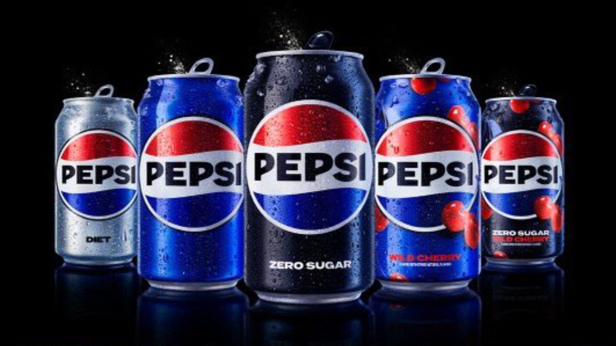
A WELL-known company, like Pepsi, has debuted a new logo that has all Pepsi fans in a frenzy. Yep, you did read that correctly. The new logo for the international company Pepsi is straightforward and timeless, with a hint of nostalgia.
The Pepsi brand has gone through numerous logo changes since 1898, but the one that is currently on the bottles was first released in 2008. Since then, it has been over 15 years, and it is time for a change. Todd Kaplan, the chief marketing officer at Pepsi, posted images of the new logo on his Twitter page and added the following caption: "The new era of Pepsi is here! This fall, the US will introduce our updated Pepsi brand and visual design, which I'm happy to reveal."
🚨 Welcome to a new era of Pepsi!🚨
— Todd Kaplan (@T_Kap) March 28, 2023
Couldn’t be more proud to share our new Pepsi logo and visual identity that we will be rolling out in the US this fall! pic.twitter.com/OC80a6PyDd
After unveiling the new logo, Pepsi itself stated that the new appearance would be introduced to the North American market this fall and would be made accessible globally by 2024, the year of the company's 125th anniversary.
Allow us to reintroduce ourselves… 👀#Pepsi #PepsiProud #Design pic.twitter.com/zWXHlfEHiu
— Todd Kaplan (@T_Kap) March 28, 2023
According to a report in CNN, this new logo, with Pepsi written at the centre of the globe, looks more like the 1990s version, which seems to have stuck in people's minds. Hence, by eliminating the minimalistic approach to the existing design, Pepsi decided to keep it strong, bold, and confident. "We couldn't ignore that kind of insight... Instead of rejecting it, we decided to embrace it," said Mauro Porcini, PepsiCo's chief design officer, as per CNN. The report further says that the change in the logo is also to draw attention to the company's zero-sugar line, which plays a key role in its future growth plan.