- By Alex David
- Tue, 06 May 2025 01:15 PM (IST)
- Source:JND
By mistake, Google has leaked information about its upcoming Android design language, Material 3 Expressive, giving us the sneak peek of the possible big UI shift Android users will experience in the future. This leak by Google came through a developer resource update and highlighted a more flexible, vibrant, and customisable Android visual design. Material 3: Authoritative builds on Google’s Material You theory, adding deeper colour palettes, more fluid theming, stronger visuals, and customisation-focused elements for user engagement. Although Google has not officially confirmed the date for this release, the accidental leak has ignited buzz within the tech world. In the coming weeks, Android enthusiasts can gear up for a supremely optimised experience visually, one that is centred around fluidity, consistency across devices and applications, and robust tailoring to users’ specifications.
Ahead of the Google I/O 2025, Google has slipped a pre-launch sneak peek of the material 3 expressive design where they outlined the changes to be made. They mistakenly put out a blog explaining the design philosophies and the research preceding Material 3 Expressive. It was 9to5Google that spotted this and made public the detailed compilation they did with the help of WayBack Machine.
Material 3 Expressive
“Material 3 Expressive” is what google refers to as “the most bold new direction for design” and “the most researched update to google’s design system, ever”. Google states that “with apps, it is no longer a ‘clean’ and ‘boring’ era. Such designs need to be interfaces that interact with a user emotionally. That goes by the name of Expressive design.” It is also known by its short form, “M3 Expressive”.

Credits: 9to5Google
In 2022, the Material Design team began posing the question, “Why do all of these apps look so similar? So boring? Isn’t there room to enhance the emotion?”
Google’s research studies included:
Eye tracking: Looking into the area of concentration of the users.
Surveys and Focus Groups: Analyzing the emotional impact to design and sentiment.
Experiments: Collecting the emotions and preferences
Usability: The time needed for the participant to understand the interface and start operating.
The Expression framework gave birth to the "floating toolbar".Conceptual sketches show a bottom bar with pill shape that does not cover the entire width of the display. This means a portion of the background is still visible. This style of implementation follows what already exists in Google Chat. Research results indicate that such elaborate designs as the floating toolbar, enable better interaction and allow users to locate essential actions on every interface page quickly, therefore improving their overall experience with the system.
It bears repeating that these are all concept designs. Let’s emphasize once again that they don’t represent real products. (In a more final version, a Google Clock redesign leaked over the weekend.) Aside from that, clearly Gmail’s current UI is what’s shown in the “before” example below.
Other concept designs show a photo editor and payments alongside voice input, a clock app, and a wallet: Material 3 Expressive leak.
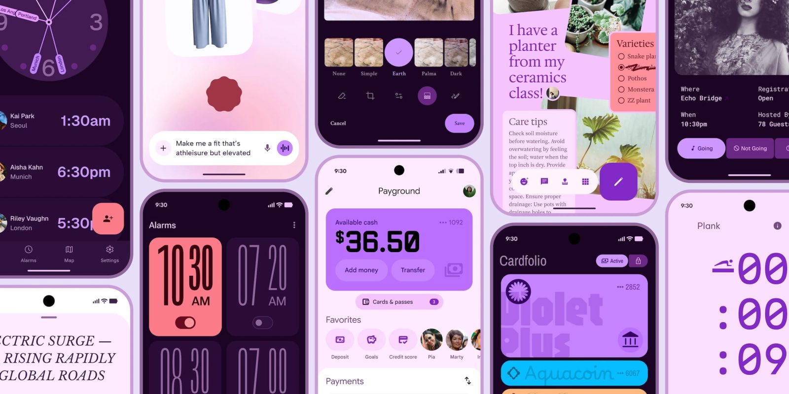
Credits: 9to5Google
User research and testing have also revealed that a well-applied expressive design is “strongly preferred by people of all ages” over non-expressive designs based on the iOS Human Interface Guidelines. Google has “expressive” in regard to brand coolness, or “cool” as they found: “Our research showed that using M3 Expressive design boosted how “cool” people thought a product was.”
Material 3 Expressive Overview
As Google defined Material 3 Expressive, “the new direction of design is to connect with people emotionally.” This follows three years of research involving 46 studies with more than 18,000 participants hosted around the globe. Their designs focus on the beauty and usability of an application by color, shape, size, motion, and containment. Essentials include bold use of elements like shape and color and something called “floating toolbar” that highlights important actions. Stronger usability and popularity among users of all ages support the shift towards more expressive designs.