- By Alex David
- Tue, 13 May 2025 11:41 AM (IST)
- Source:JND
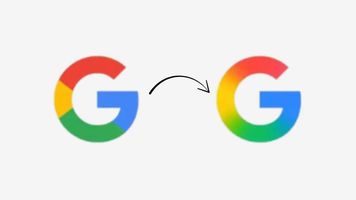
Google is making a subtle yet symbolic change with their redesign of their iconic “G” logo since 2009. The updated version replaces its traditional four-colour design with a gradient comprised of red, yellow, green, and blue shades that smoothly transitions. Google is continuing its push into artificial intelligence with this visual refresh, seeking to reflect innovation and modernity within its brand identity. Though this change may appear minor, especially on smaller screens, it represents an important strategic move toward unifying Google's aesthetic with Gemini AI's next-generation technologies and ecosystem. As AI becomes an integral component of its ecosystem, this gradient-based design could set the precedent for branding across its vast range of services and platforms.
Google’s 'G' Logo Gets a Modern Makeover
Google recently unveiled a modernised rendition of its signature “G” logo, shifting away from solid colours toward an eye-catching gradient with shades from its four traditional hues. The change can be found gradually appearing on iOS devices via the Google Search app and being tested through beta releases of version 16.18 on Android phones. Though any differences may seem minor at first glance, particularly on smaller icons, it nonetheless marks an evolution in their design language to support AI-first branding strategies.
No Changes to Google Wordmark — Yet
Although they made changes to their 'G' icon, Google has not altered its main wordmark or updated any product logos like Chrome or Maps logos. However, given Google's ongoing AI integration across products, it could likely apply gradient treatments on other icons in the future to keep visual consistency across products.
Aligning With Gemini’s Aesthetic
This redesign marks Google's first logo update since 2015 and closely aligns with the aesthetic introduced by its artificial intelligence-powered assistant Gemini, featuring a blue-to-purple gradient logo. This shift indicates that they prefer more dynamic visuals that capture artificial intelligence's fluid nature.
Gradual Rollout Across Platforms
So far, the new “G” icon can be seen on iOS and Pixel devices; other Android phones and web platforms still display its predecessor version. A larger rollout is expected within weeks; eventually this design should replace its previous counterpart across all devices and applications.
I think that Google’s updated ‘G’ logo marks more than just a visual tweak—it’s a statement about the company’s direction as it embraces AI-driven design and functionality. As the tech giant continues to invest heavily in artificial intelligence(AI), this fresh visual identity may become a hallmark of its next digital chapter, subtly reshaping how users interact with Google’s ecosystem.