- By Ashish Singh
- Thu, 21 Sep 2023 06:18 PM (IST)
- Source:JND
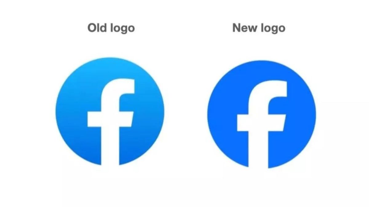
Facebook, a major social media platform, has redesigned its logo, wordmark, and reaction emojis. The logo appears to be quite similar to the previous one, although it is darker and continues to employ the lowercase alphabet 'f'.
Meta, Facebook's parent company, has already altered the logo on its website, and the wordmark has also been changed to the Facebook Sans font and received minor cosmetic upgrades. The same blue colour is used in the logo, but the typography is different.
"Our goal was to create a bolder, more electric, and long-lasting redesign of the Facebook logo. As a major component of the app's identity, each of the various new enhancements fosters greater coherence across the overall design. We accomplished this by introducing a bold representation of Facebook's fundamental blue colour, which is designed to be more visually approachable in our app and gives greater contrast for the "f" to stand out," the company said in a statement.
Behind the logo change, the company highlighted three key drivers which are: elevating the most iconic elements of the brand, unifying Facebook as a brand, and creating an expansive set of colours.
The social media giant also revealed that it presently has over 2 billion daily active users. With the new logo, the firm hopes to create a lot more distinct, refreshed identity and intends to make the platform more accessible to users worldwide.
Recommended For You


READ: Meta Threads Now Rolling Out 'Keyword Search' Feature To More Countries; Is India On The List?
Not only that, but the Facebook parent firm has revealed reaction emojis and altered colours, giving it a new design. It also stated that the new emoji would be released in the following months. The business also revealed that Facebook is presently working on a big redesign of its app, with new features being introduced in stages.